|
1. An ID or CLASS that changes the color of a subheading.  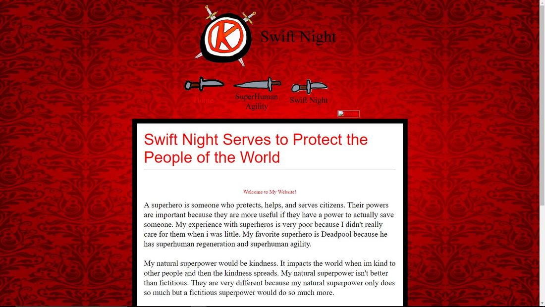 2. Add a CSS INVISIBLE COMMENT TAG.  3. Change a subheading to a GOOGLE FONT.   4. Change a subheading to an EM SIZE.   5. CSS STYLE your links. Use a BACKGROUND CHANGE (and anything else that you may like.)  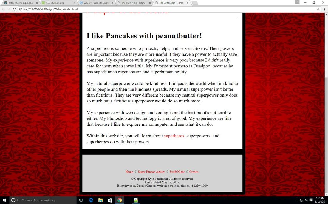
0 Comments
1. Using a pixel font size is most closely related to using a font size in which Microsoft program? It is closely related to the font size in Microsoft Word. 2. Why are ems considered best practice? It is considered the best practice because it works in all browsers, while pixels don't always work in Internet Explorer. Put these font sizes into ems: 70px, 36px, 10px Practice using ems with both a subheading and a body paragraph. Take a screenshot of both the CODE and RUN. 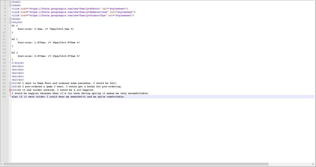 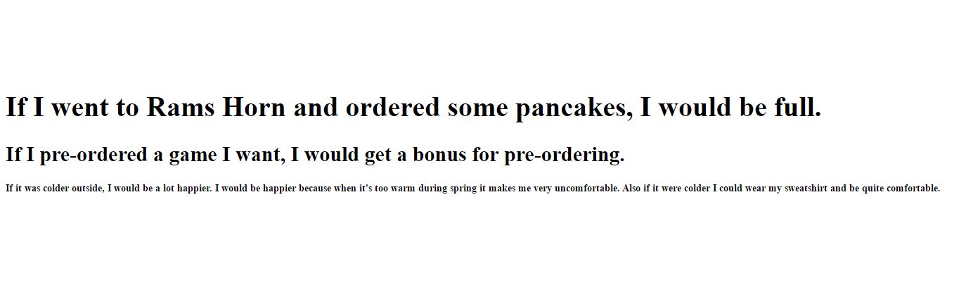 3. What are the four link states? How will you remember them (and their order)? The four link states are a:link, a:visited, a:hover, and a:active. I will remember them by making a 4 letter abbreviation LVHA. Practice using these states by styling them with color, declarations, and backgrounds. Take a screenshot of both the CODE and RUN. 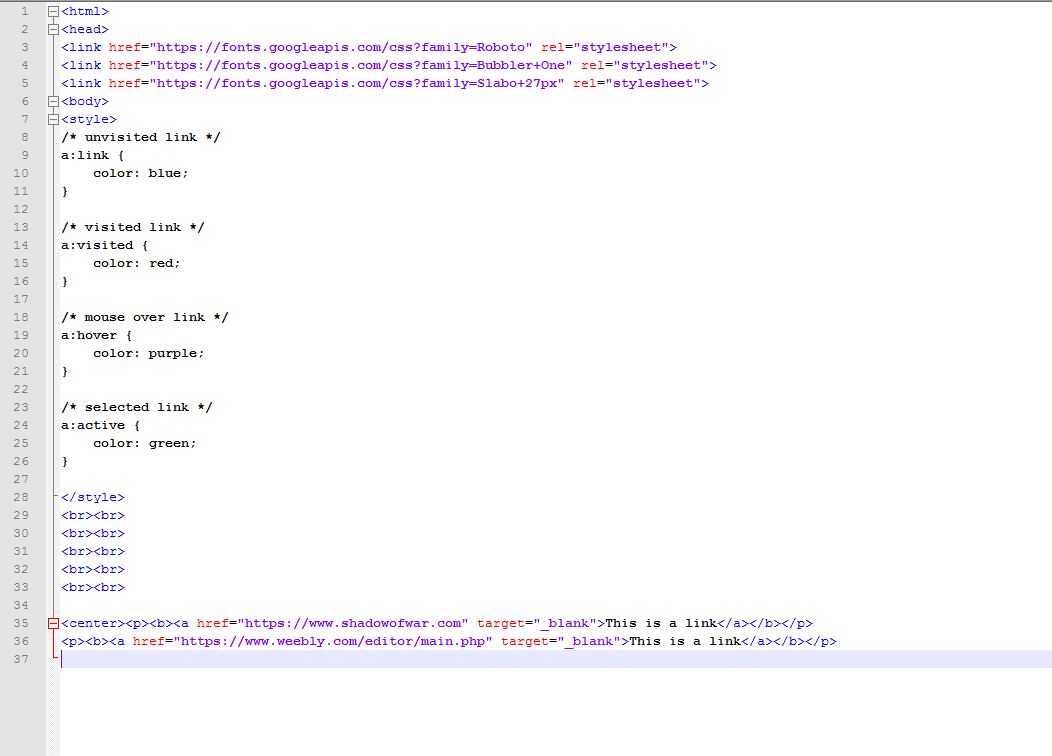 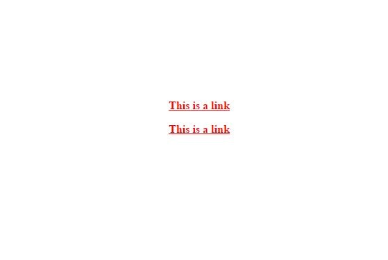 Go ahead and find a cursor that works for you and demonstrate your mastery of this code by taking a screenshot of RUN. <— It won’t show up in a screenshot, but I do want to see the code. 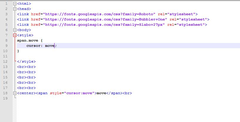 Review the CSS background section. Do not get too technical here. I’ve always wanted my background to stretch to all screen sizes and now there’s an easy way to accomplish this. Use this link and copy the first example. Find a background picture and take a screenshot of both the CODE and RUN to show me that it works. 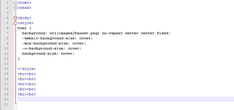 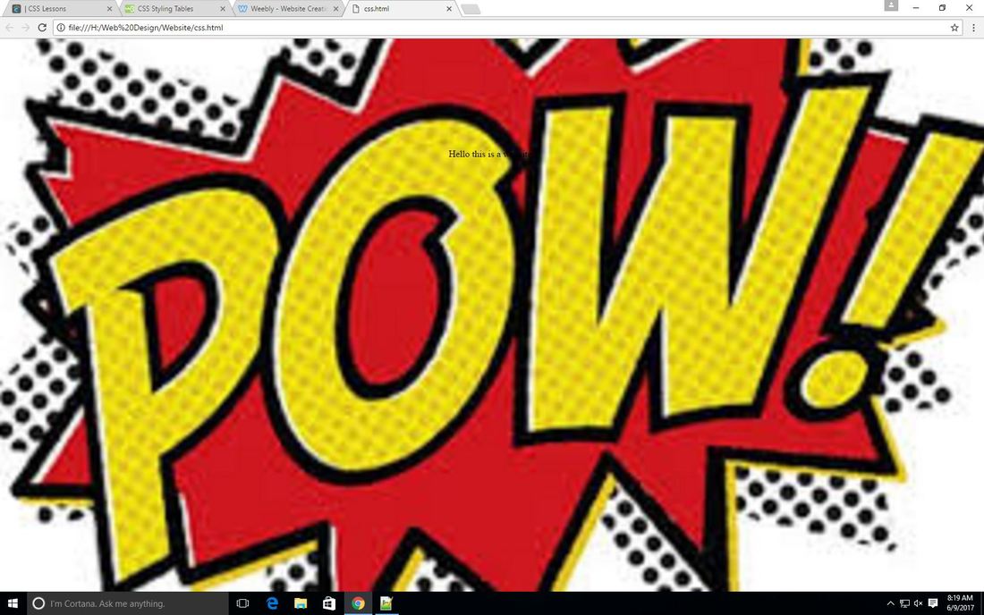 Change the color of an h2 that says Web Design Rocks to yellow Center that same h2. Create a link to your blog which removes the line underneath. Remember, you should never have the entire link displayed when you RUN. Type your name within an h3 and place an overline on it. Use either a text transformation or indentation is some fashion.  1. What is the difference between a system font and a web font? Why would you rather use a web font? The difference between a system font and a web font is that a system font is built in to the computer and a web font are fonts you cant normally get in system font. I would rather use a web font because then I would have a wider variety of fonts to choose from. 2. Which type of font should you use within your body text? Explain. Where could you use the other type of font? The type of font I should use within my body text is sans serif because it looks better to have tails on the end of my letters in the body. I could use the other font in the headings. 3. Select 3 different web font families, type (#1: Google Font Example Sentence: If the cafeteria staff served chocolate chip pancakes today, I would be in heaven!) 3 random thought sentences, take a screenshot of the CODE and RUN, and post your results on your blog. 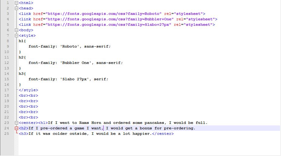 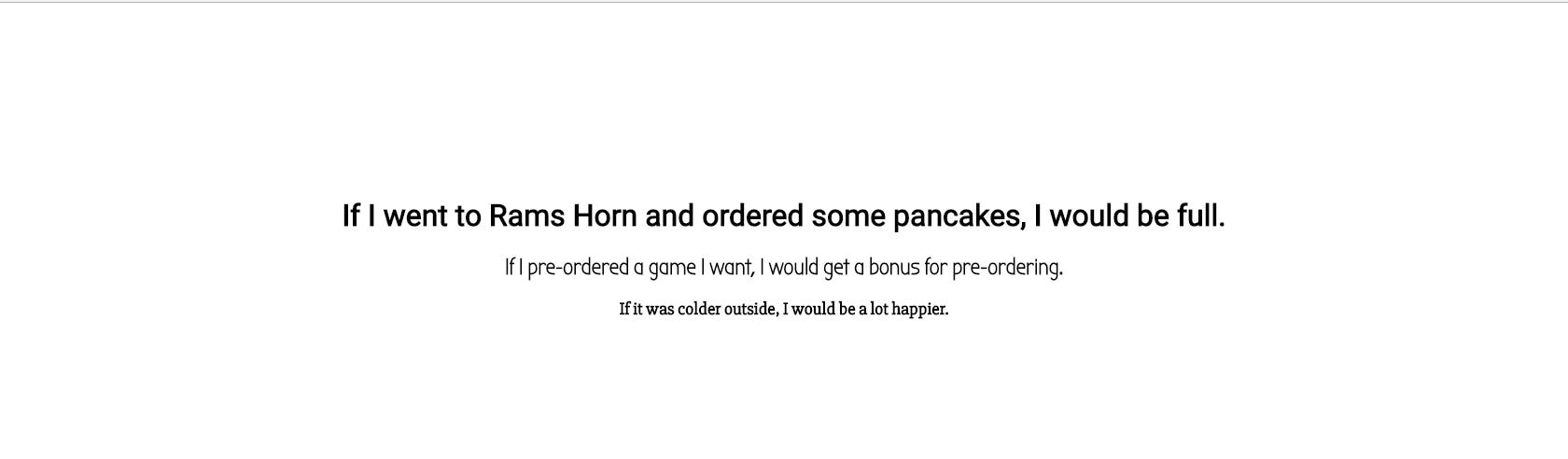 4. Which GOOGLE FONT do you feel could capture the feel of your site? Why?
I feel that cormorant sc would capture the feel of my website because it looks like medieval letters and my superhero is medieval. 1. What is CSS? How is it different from HTML? CSS stands for Cascading Style Sheets and it describes how HTML elements are to be displayed on screen, paper, or in other media. CSS is different from HTML because was never made to style webpages but, only for layout purposes and CSS was made for styling purposes. 5. Screenprint a CSS comment tag that answers this question: Why is the sky blue? 2. Show me your own example of CSS Syntax with each part labeled (what they are called). You can take a picture from your notes, write it out in Notepad++, Paint, or Word. The method is up to you. 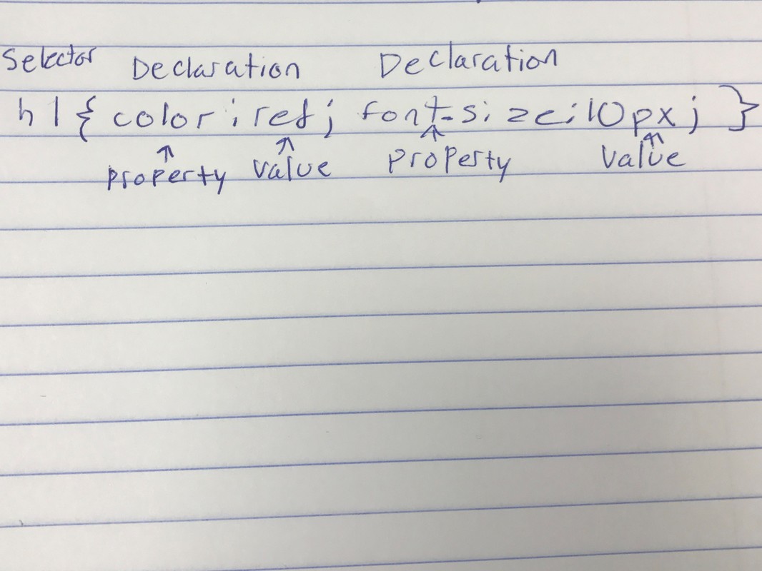 3. Screenprint an ID and Class selector in both CODE and RUN. 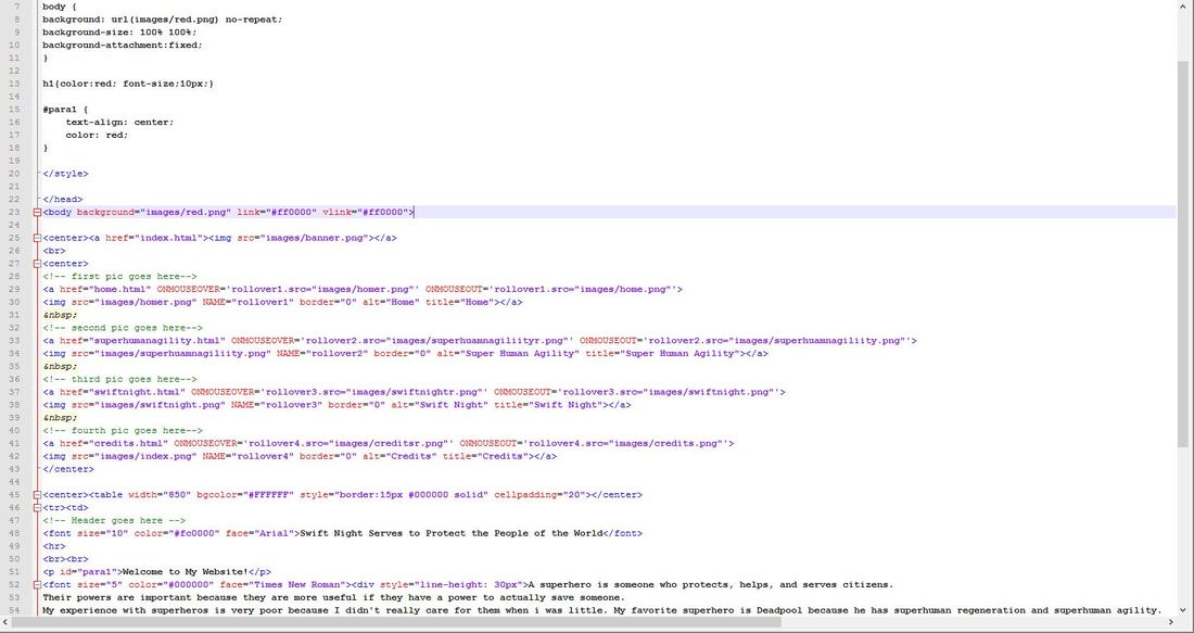  4. What are the three ways to insert CSS? Which one will we be using the most in class? 5. Screenprint a CSS comment tag that answers this question: Why is the sky blue?
1. What was overall biggest issue people saw in everyone's presentations?
The biggest issue people saw in everyone's presentation was that a lot of people are shy. 2. What is the one thing my peers thought I did the best? They thought that my superhero page was the best. 3. A negative for me? I was too shy. 4. Best advice I got? The best advice I got was to be more assertive and look more at the class than at the board. 5. Who had the best overall presentation? I would say that Tyler had the best overall presentation. 6. What would my theme be for next years people? The theme I would pick for next year's people that would be the most enjoyable would be music. 7. What the 3 pages would be? It would be favorite instrument, favorite type of music, and favorite band. We learned about applying a LOMO camera effect, using styling match, fixing blemishes, clone stamp, adding effects, and using layer style this week. The lesson I enjoyed the most this time was adding effects. I enjoyed that the most because I can add borders and shadow effects. I would use it on my website for my pictures that go along with it. Keith Haring is known for the pop art idea. Cross processing is a tool that adds saturation to a picture for the LOMO camera effect. Applying a vignette adds darkened edges.  I used the LOMO camera effect on the Guided edits, I clicked on it, then I clicked the cross process image button, which apply's a saturation effect, and the Apply Vignette button, which darkens the edges.  I got the border by going to edit and staying on full mode. I then clicked layer style and selected bevels, then selected a border  I went to edit and stayed on full then clicked on all effects, then selected a effect. What have you gained from taking this course that a traditional class may not have granted you?
I have learned many things in this class that a traditional class may not have granted me. One thing I have gained from taking this class is the ability to make my own website if I really wanted to. Another thing I have gained from taking this class is how to make my website look neat. I have also learned how to make tables in my website. One more thing I learned in this class is how to make words in different fonts and sizes.
https://docs.google.com/a/shorian.org/forms/d/e/1FAIpQLSci5FWG2QLV2Cee1xBdx9GIlklvXfmcI2FVldTZGR3Ok0P3iw/viewform?usp=sf_link
Which part is most important? The most important part of readability of a website is font size and line spacing. Which part do you struggle with the most personally and why?
The part that I struggle with the most is choosing the right font. The first page of my website turned out pretty well. My favorite feature would probably be the navigation buttons at the bottom. My least favorite feature would be the margin. I wouldn't make any changes in the future. My rating of it would be a 5 out of 10. 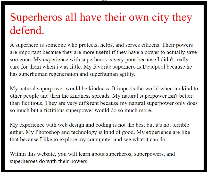 |
AuthorWrite something about yourself. No need to be fancy, just an overview. Archives
June 2017
Categories |
Zoe's Dish
 RSS Feed
